

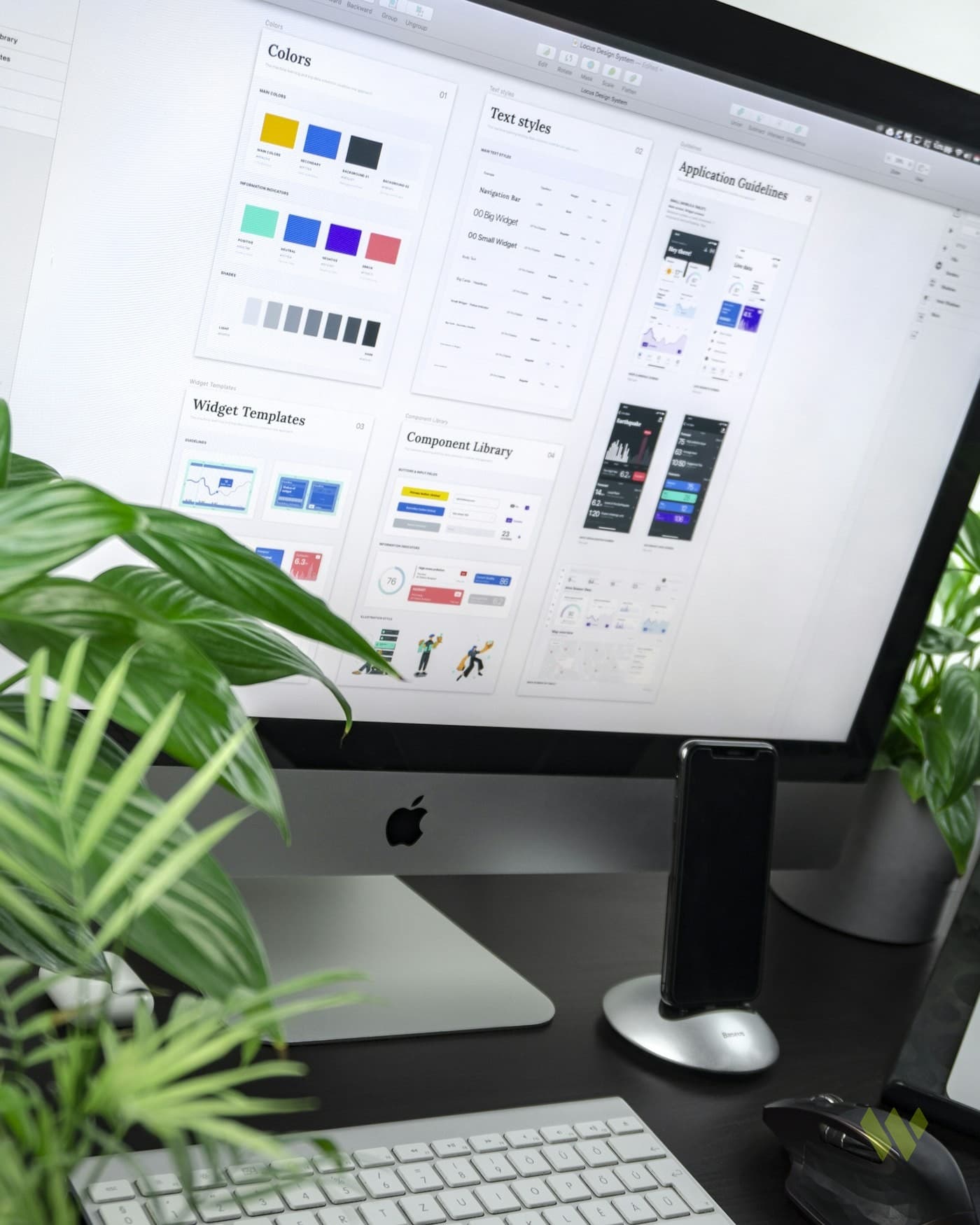
Why Real Project Screenshots Beat Abstract Stock
Your portfolio and blog should show the work. Stock metaphors and purple gradients do not build client trust.
“If the image could belong to any agency, it belongs to none.”

Abstract stock photos make every brand look rented. Real project screenshots show the craft, the UI, and the context buyers actually evaluate. weROI is a Kingston agency that prefers live work, permitted captures, and honest process over generic laptop-on-desk metaphors that could sell any SaaS template. Buyers comparing agencies in Jamaica and abroad can tell within seconds whether you ship real interfaces or rent atmosphere from a stock library.
This article explains why screenshots beat stock for service and product brands in Jamaica and worldwide, how to capture them without breaking trust or NDAs, and where to place proof so it helps decisions instead of decorating the hero. You will leave with a practical proof kit your team can maintain. A maintainable proof kit turns every launch into sales enablement instead of a one-off screenshot scramble before a pitch.
Buyers trust what looks operable
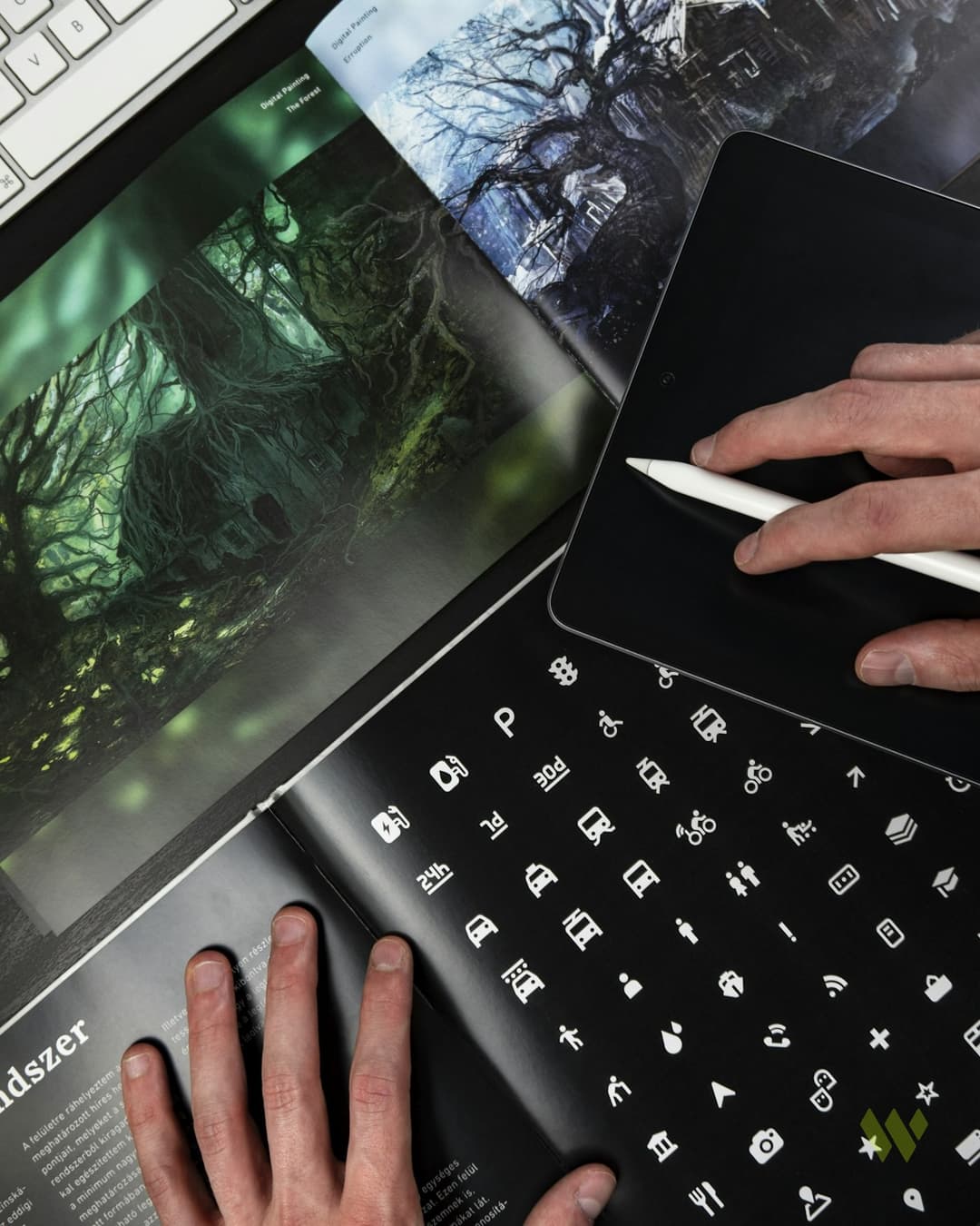

A serious prospect scanning a web design or software page wants to see navigation, type, and real content density. Stock lifestyle shots skip that evaluation. Screenshots of public sites, dashboards you are allowed to show, and before-and-after layouts communicate competence faster than metaphors.
Jamaican and diaspora buyers are especially sensitive to polish that feels imported without substance. Showing Portmore ministry pages, marketplace flows, or hospitality booking paths you actually shipped roots the brand in delivery, not aspiration.
When you cannot show a full product, show a permitted crop that still reveals typography, spacing, and information hierarchy. Abstraction should be a last resort, not the default hero.
Permission, privacy, and what to crop
Protect people and private data
Only publish work you have rights to show. Crop private messages, personal data, and unpublished admin screens. Prefer public URLs and marketing pages. When a client allows a case story, agree on which frames are public and which stay internal.
Never invent metrics overlays on screenshots. If you annotate, label process steps, not fictional growth percentages. Trust collapses when a sharp buyer asks for the source of a badge you fabricated.
Store permission notes beside each asset. Six months later nobody remembers which client allowed which frame, and guessing is how relationships break.
Where screenshots belong on the site
Place proof near decisions: service pages, work grids, pricing philosophy sections, and contact paths. A hero can use one dominant real visual. Avoid card piles of tiny unreadable UI. Large, honest frames with short captions outperform collage walls.
Pair each screenshot with a one-line context: who it was for, what job it solves, and whether the URL is live. That caption does more for conversion than a floating sticker that says award winning without a story.
On service pages, alternate a large screenshot with a short process caption so skimmers get craft and context without a novel of text above the fold.
Brand photography still has a job
Real places, teams at work with consent, and craft details complement UI screenshots. The mistake is replacing all substance with stock abstractions. Atmosphere helps; empty symbolism does not. Choose photography that could only belong to your category and geography.
Update alt text when UI copy changes. Accessibility and SEO both benefit when the description names the job on screen instead of saying image one.
- Public live URLs linked beside key frames
- Consistent device framing so the grid feels intentional
- Alt text that describes the interface job, not decorative filler
- Compressed images that still stay sharp on retina phones
- A quarterly refresh so proof does not age into outdated UI
Using screenshots in ads and proposals
Paid creative and PDFs should match the landing page language. If the ad shows a booking UI, the lander should open on that product story. Mismatched stock in ads and screenshots on the site trains platforms that your page is irrelevant and confuses humans.
weROI builds brand systems where proof assets are first-class: organized folders, naming conventions, and usage rules so freelancers do not grab random Unsplash by default. That discipline keeps Kingston delivery looking coherent for worldwide clients.
In proposals, deep-link to the public work grid rather than attaching outdated PDF collages that drift from the live brand.
Building a maintainable proof library
After each launch, capture desktop and mobile frames, store approved quotes, and note permissions. Assign an owner. A proof library that updates with shipping becomes a sales advantage. A folder of outdated PNGs becomes a liability.
Quarterly, delete assets that no longer match the current offer. Stale proof quietly trains the wrong expectation in new leads.
Practical steps you can take this week
You can improve proof this week without a full rebrand.
- List five public projects or pages you are allowed to show and capture fresh screenshots. Prefer public URLs you can link beside the frame.
- Remove or demote abstract stock that could belong to any competitor on money pages. Keep one abstract image only if atmosphere truly needs it.
- Add short captions with context and live links where permitted. Make captions scannable on a phone.
- Crop any private data and confirm client permission for borderline frames. When unsure, leave it out of the public site.
- Compress and standardize framing so the work grid looks intentional on mobile. Match crop ratios across the work grid.
- Store approved assets in a shared folder with naming rules for future campaigns. Name files by client and year for retrieval.
FAQs
What if the client will not allow screenshots?
Use process diagrams, anonymized wireframes labeled as illustrative, and public aggregate language. Never fake a UI. Offer a private walkthrough for serious buyers instead of inventing visuals. Private walkthroughs under agreement often close serious buyers faster than fake public UI.
Are stock photos ever acceptable?
Yes for atmosphere or category context when real capture is impossible. They should not be the only proof on a craft or software page. Lead with operable work whenever you can. Lead with operable work whenever permission allows and keep stock in a supporting role.
Should screenshots include browser chrome?
Consistent framing helps. Light browser chrome can signal realism. Heavy fake device piles often look dated. Pick one system and stick to it across the site. Consistency across the grid matters more than trendy device mockup packs.
How does this affect SEO?
Unique images and descriptive alt text support relevance. More importantly, proof improves engagement and conversion, which makes organic traffic valuable instead of decorative. Better engagement and clearer relevance help organic traffic become pipeline.
Can weROI rebuild our visual proof kit?
Yes. Branding engagements often include screenshot standards, work-grid layout, and rules for ads so your public story matches shipped work. Pair the kit with voice rules so captions stay claim-honest across freelancers.
Shot lists for credible portfolio imagery
Capture homepage first viewports on desktop and mobile, key conversion moments, and brand applications in the wild when permitted. Name files by project and date so future blogs do not grab the wrong screenshot.
When stock is necessary for topical essays, match the topic literally. Kingston context for local SEO stories is fine. Random luxury interiors for a software article are not.
Going deeper on Why Real Project Screenshots Beat Abstract Stock
This section expands practical guidance for teams working with weROI on branding initiatives across Jamaica and worldwide remote delivery. Use it as an operating checklist beside the steps above.
Brand clarity is an operating asset. Positioning, voice, and visual tokens must work in WhatsApp avatars, proposals, Instagram grids, and international decks without reinventing the system each time.
Key takeaways
- Real project screenshots beat abstract stock for craft trust
- Publish only permitted frames and never invent metric overlays
- Place proof near decisions with short honest captions
- Maintain a proof library that updates after every launch